BI Application for claims management


Context

Singapore Business Unit of Zurich Insurance Group being a regional hub of claims handling has a growing portfolio and needs a tool to lead the region.

Business question

Can we get insights on underwriting performance from Excel files and consolidate actionable data in one application?

Customer

Zurich Insurance Group
Zürich, Switzerland


Scope definition & planning

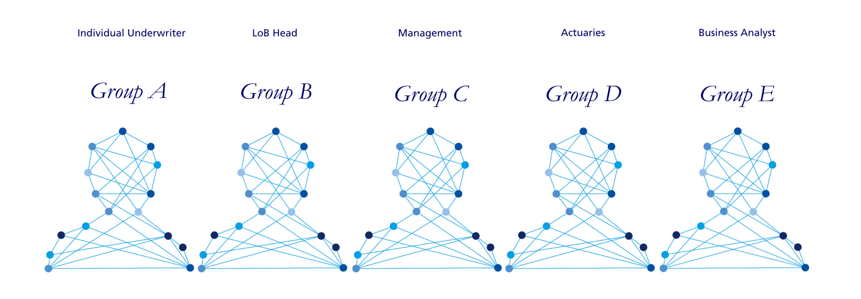
I performed Design Thinking workshop to identify user needs and customer business goals. I prioritised and negotiated features for launch and beyond. I defined the workflow with project manager.
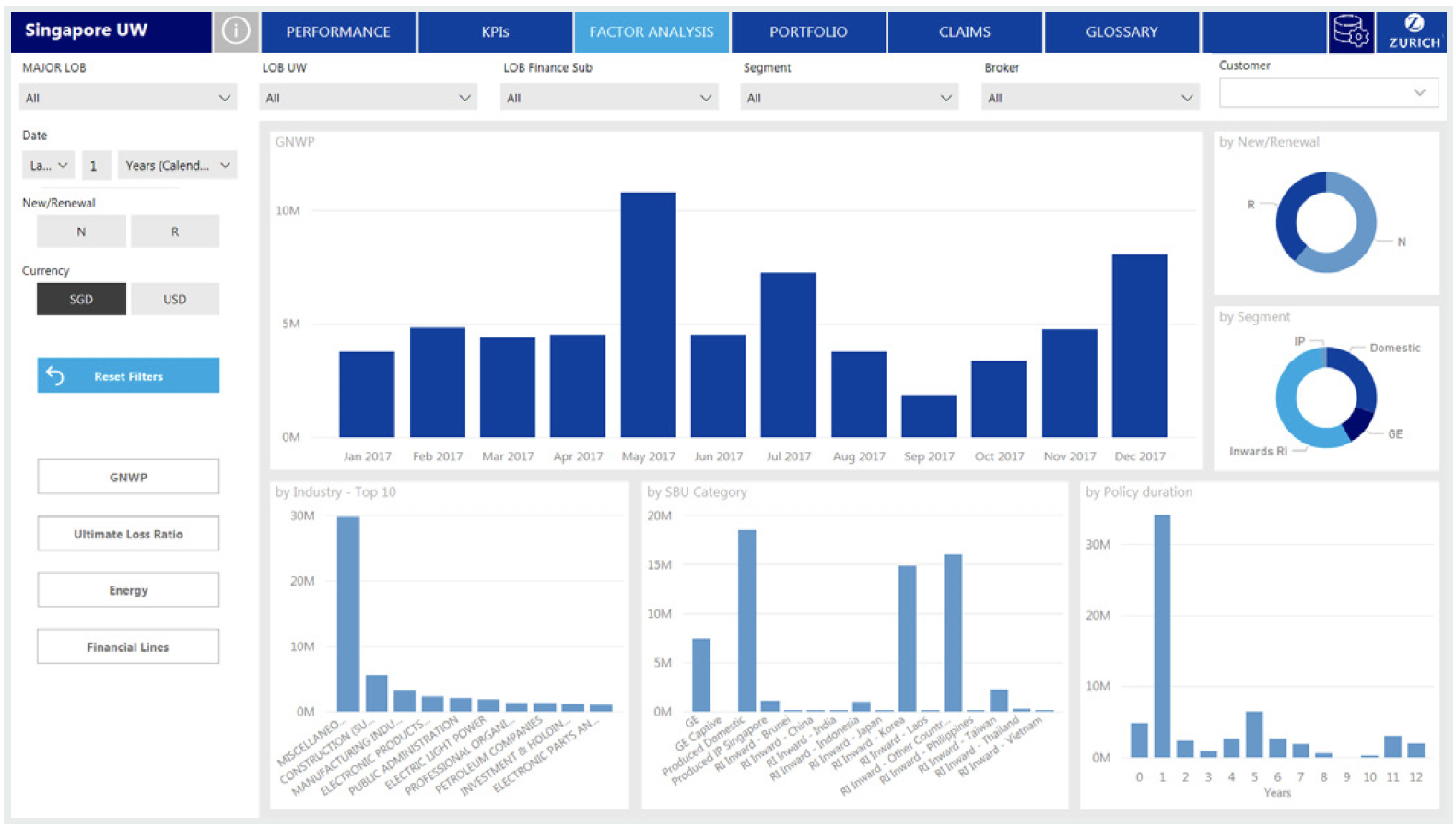
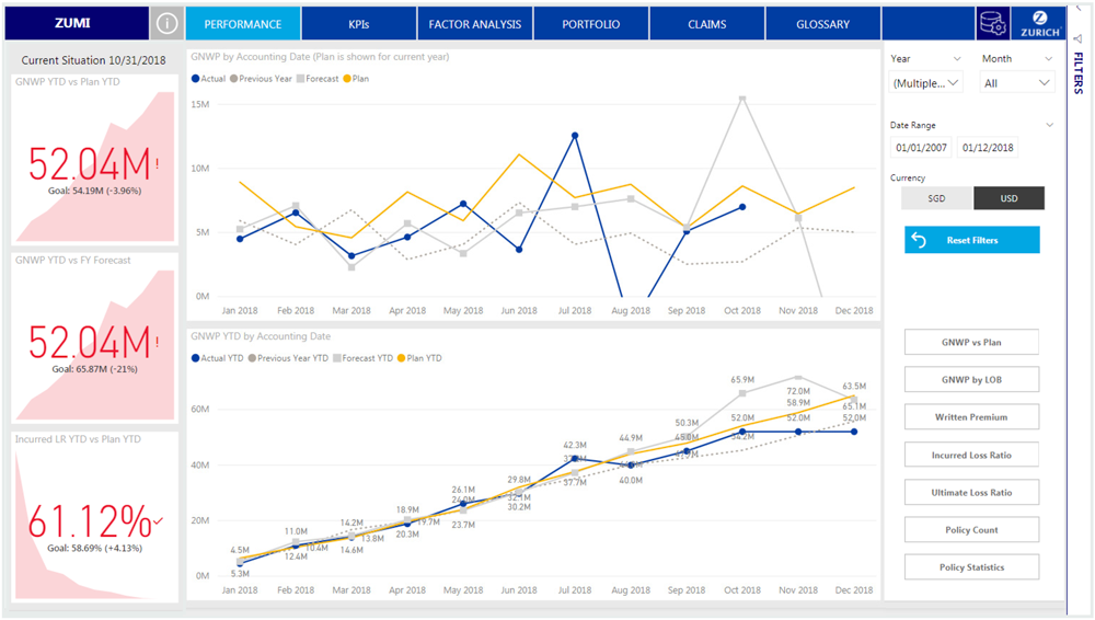
Experience strategy & vision

I created frameworks and prototypes to share the vision, design principles and content strategy. This helped to evangelise ideas, gain alignment and drive decision making.

Design execution & ideation

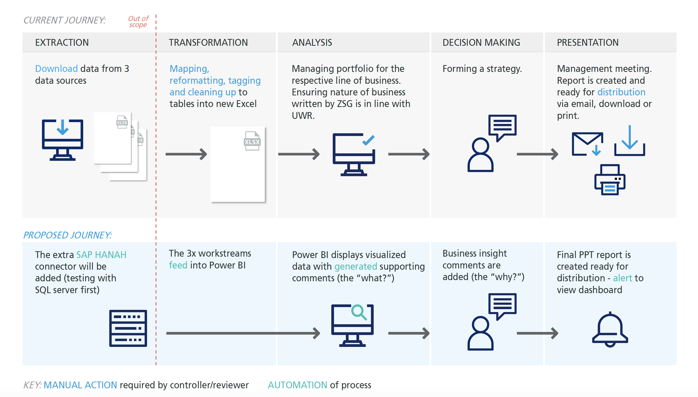
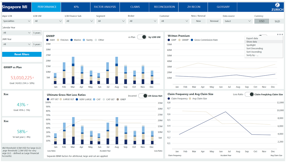
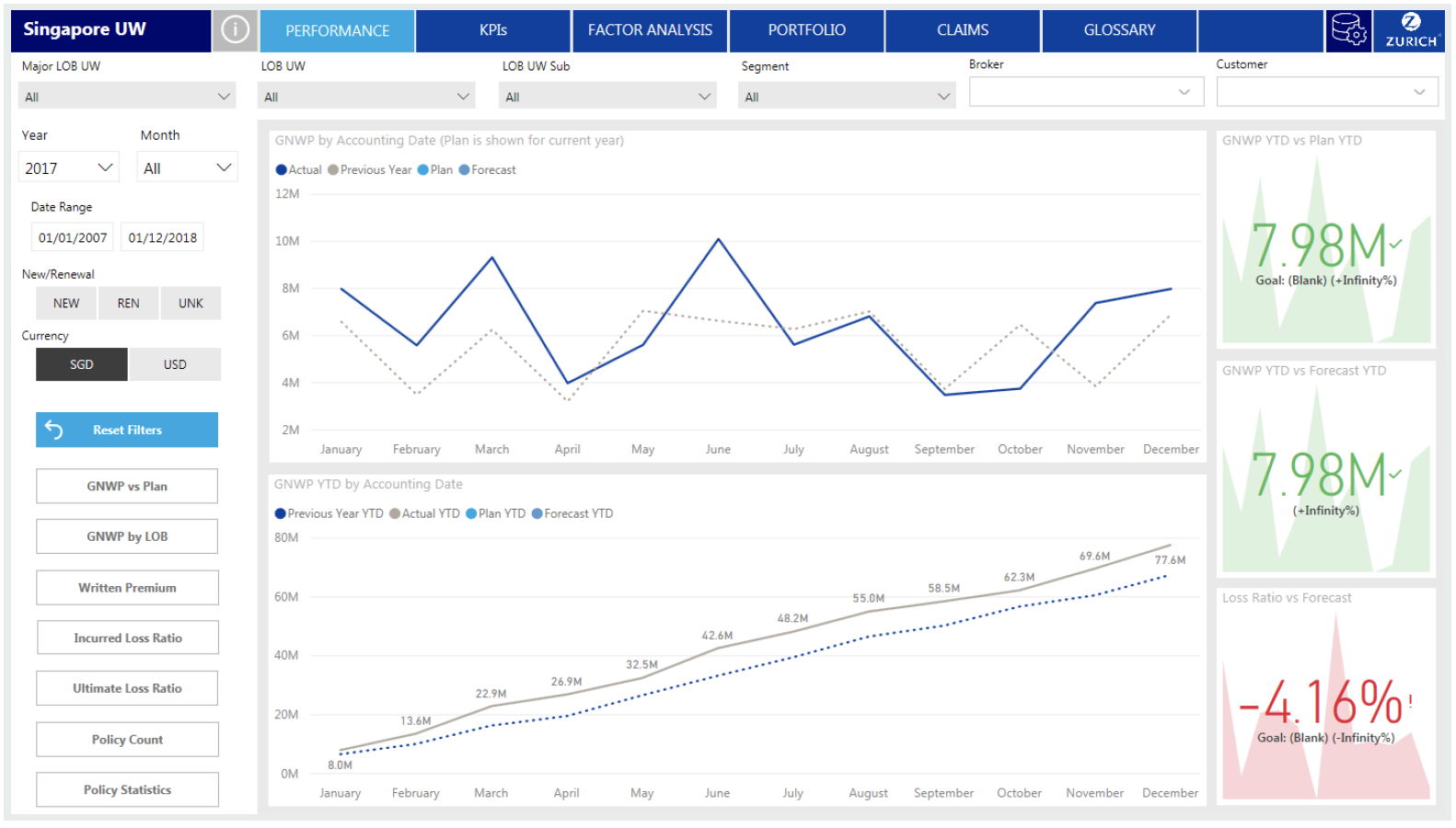
I executed journeys, wireframes and design specs. I collaborated with the lead developer to uncover insights and translate concepts into features that address user behaviours and motivations.

Coordination & leadership

I partnered with project manager to gather user feedback to translate needed features for platform context. I also presented work to stakeholders.


Identifying personas

Identifying personas

Journey mapping

Journey mapping

Focused persona: Line of Business (LOB) Head

What are user needs?

  • Tool which can help monitor and investigate portfolio by providing up-to-date information in timely manner
  • System should allow to export reports, graphs so that they can be used for management meetings, client or broker meetings or presentations
  • Data extraction - only for users with right privileges
  • Portfolio drill down at account/broker/risk/location level to list of claims

.

What are key pain points?

  • Automation - information comes from multiple sources with rare common linkage
  • Reports from actuaries are dependent on limited and expensive team resources
  • Lack of quick sharing capabilities
  • Two different calendars and currencies
  • Portfolio drill down is either not possible or very effort intensive
  • File weight, speed

Wireframing & discovery

  • Top navigation - data consumption from left to right
  • Filters order according to usability
  • Visualizations grouped thematically
  • General KPIs accessible on the left hand side
Wireframes ZUMI

Customer insights

  • Too many filtering elements - implementing hierarchy filtering
  • Too many visuals - information although grupped does not need to be seen at the same time to perform analysis (more space enables better data display) - breaking up with Excel interface
  • Power user access for reconciliation purposes with restricted access is need
  • Two types of data filter are needed: year and month selection, as well as data range with calendar pop-up
  • Portfolio drill down is either not possible or very effort intensive
  • Information section is missing - place that will contain dashboard manual and support contact information

Prototypying

Wireframes ZUMI Wireframes ZUMI

User testing results

  • Line charts are not readable enough - implementing better color and shape contrast
  • Power user access in the top right corner
  • Adding information button the top left corner
  • Subviews buttons that will take the user to remaining visuals, have been placed on the left side - can be customised for each LOB
  • Introducing interactivity to the client - possibility to filter/highlight graphs by clicking on a particular bar/section - questioning necessity of filters visibility
  • Example of a multi-factor view - main bar chart analysis by different factors
  • Color palette doubts - questioning the contrast of Zurich color palette in interface development - seeing the opportunity to create Power BI templates with custom themes and updated .JSON color palette

Final design

Wireframes ZUMI

The framework

The biggest challenge I faced throughout this project was balancing moving forward with designs, whilst collaborating with crosscontinental team and organising weekly releases. Managing feedback was tricky because of the time difference and users accesibility. The team spent a disproportional amount of time debating design decisions, when there wasn’t data that could easily be gathered to help drive a decision. I observed this pattern early enough in the project and started to create a documentation to help better articulate and distribute design rationale. Doing this saved a lot of back-and-forth as the project progressed. Design principles and the content prioritisation framework helped to create visibility into my decision making process and galvanise the team around the vision.